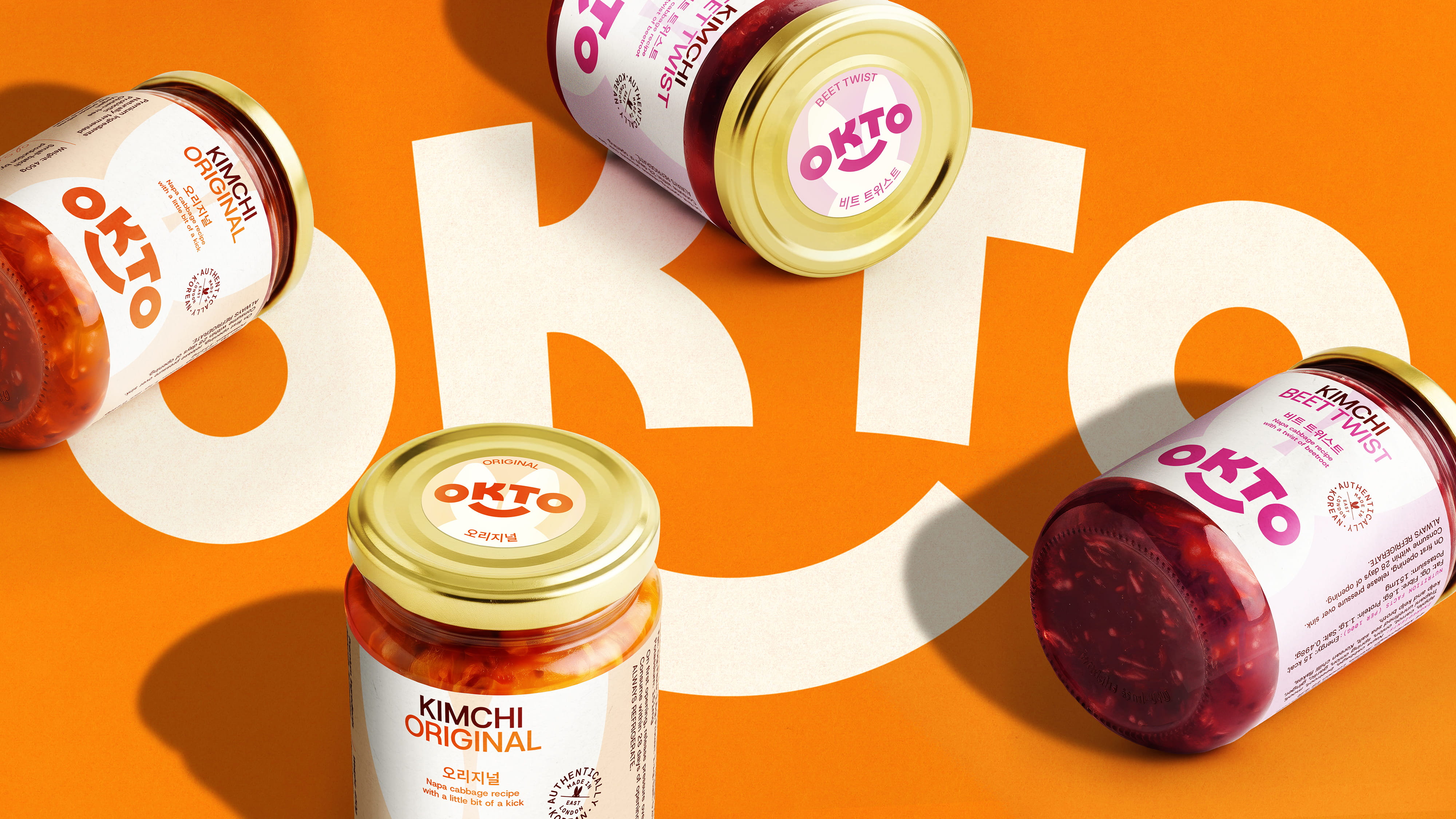
Bottling Korean folklore for London’s most intentional Kimchi
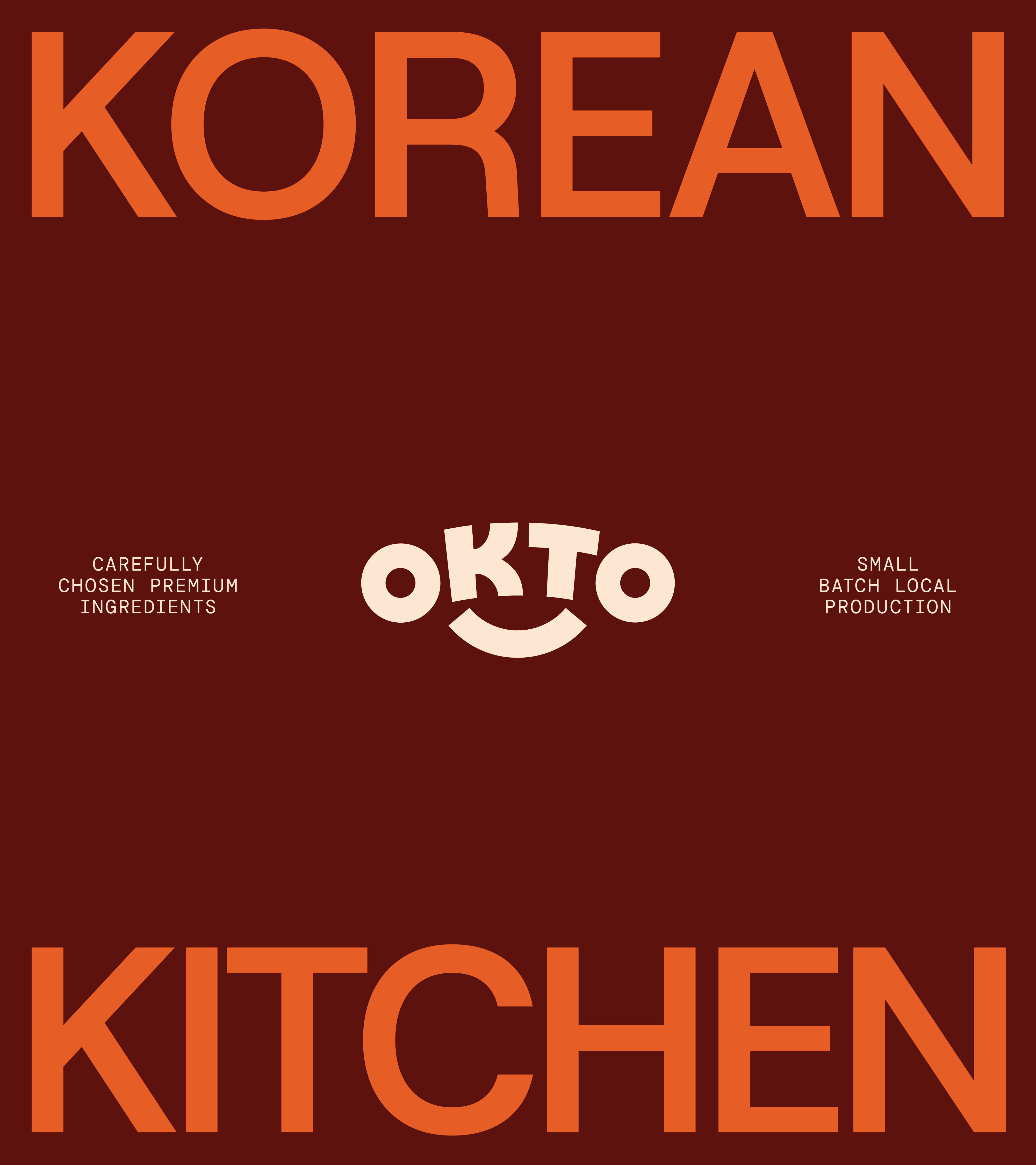
In Korean folklore, OKTOKKI the moon rabbit worked tirelessly to create elixirs of life; not for itself, but for others. OKTO a London-based Korean Kitchen carries that spirit forward: foods full of goodness made with patience, honesty, and a purpose beyond the jar.
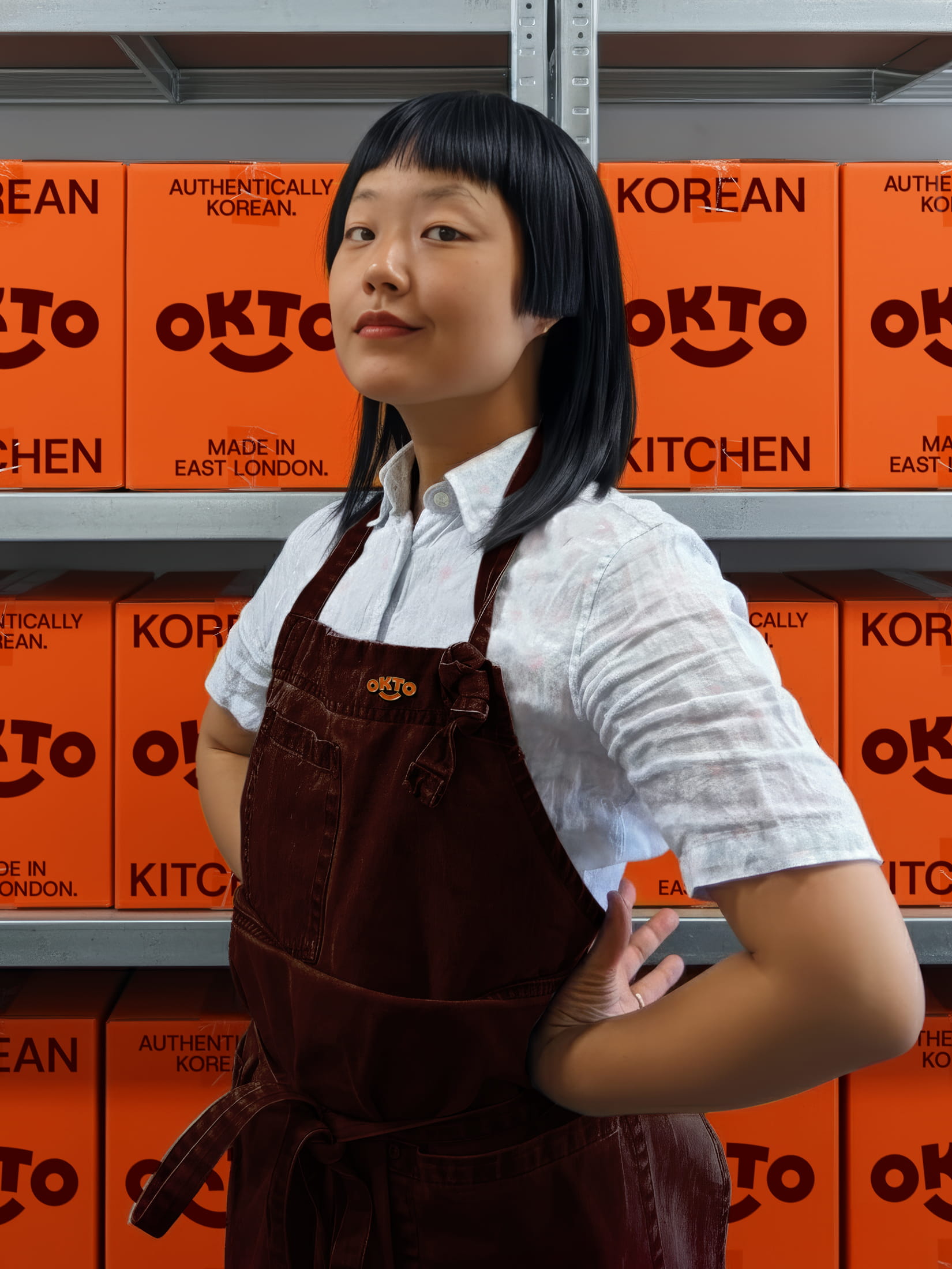
Fold7Design partnered with them to create a brand identity that celebrates the story behind their name, bridges their joint Korean heritage with London home and elevates the brand’s experience to meet their restaurant-grade quality.
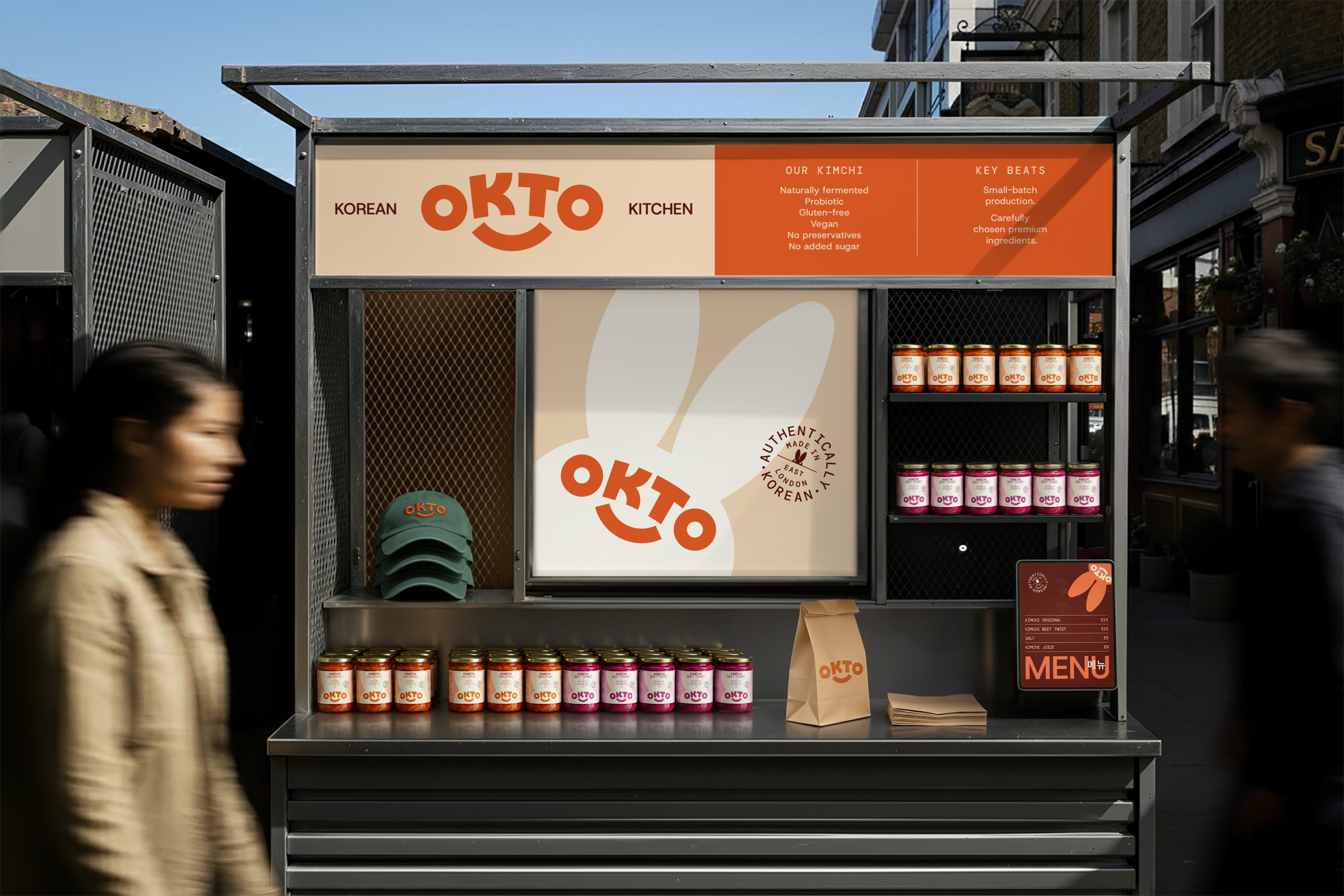
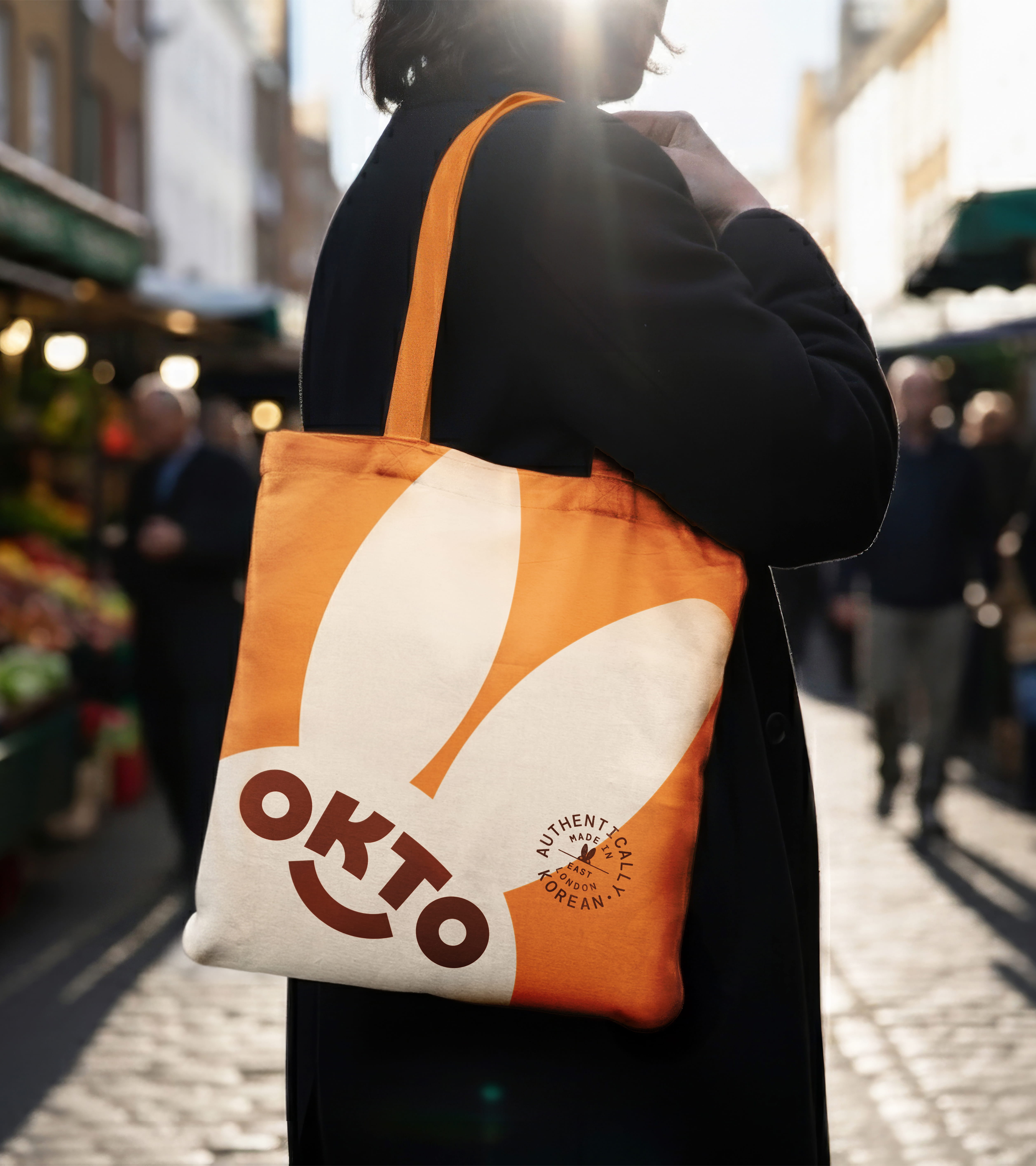
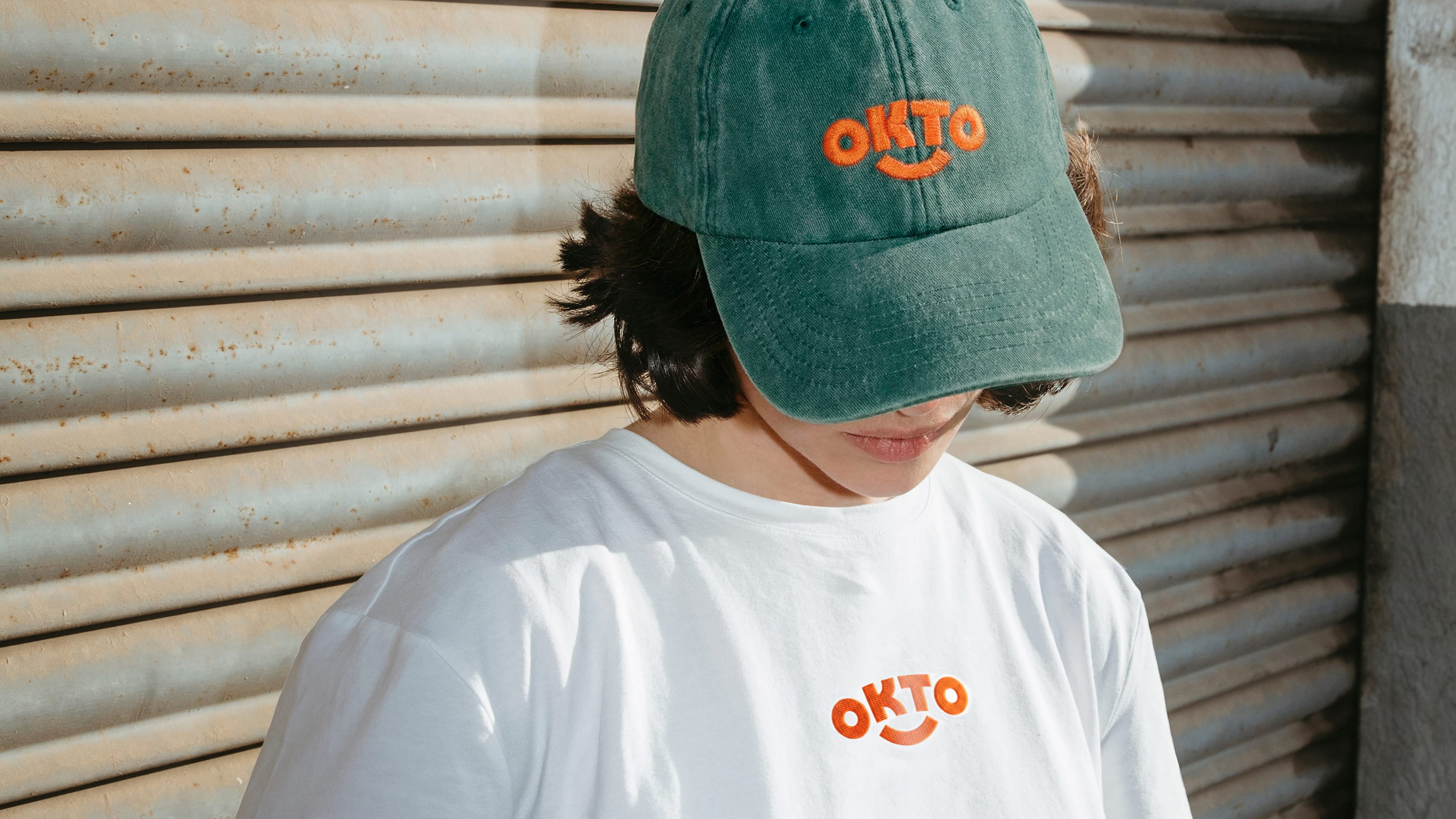
We first developed a combination mark, making their name a figurative and pictorial event in itself. The unique placement of the ‘O' letterforms either end of the name become the eyes of the moon rabbit, their spirit animal. An abstracted rabbit silhouette then becomes the main structural element of the packaging. A giant and unmistakeable supergraphic at the shelf edge.
The rabbit needed to come to life; so we developed a motion programme for the brand based of the playful characteristics of the rabbit. From hopping into frame, to ears wagging to spur a transition.
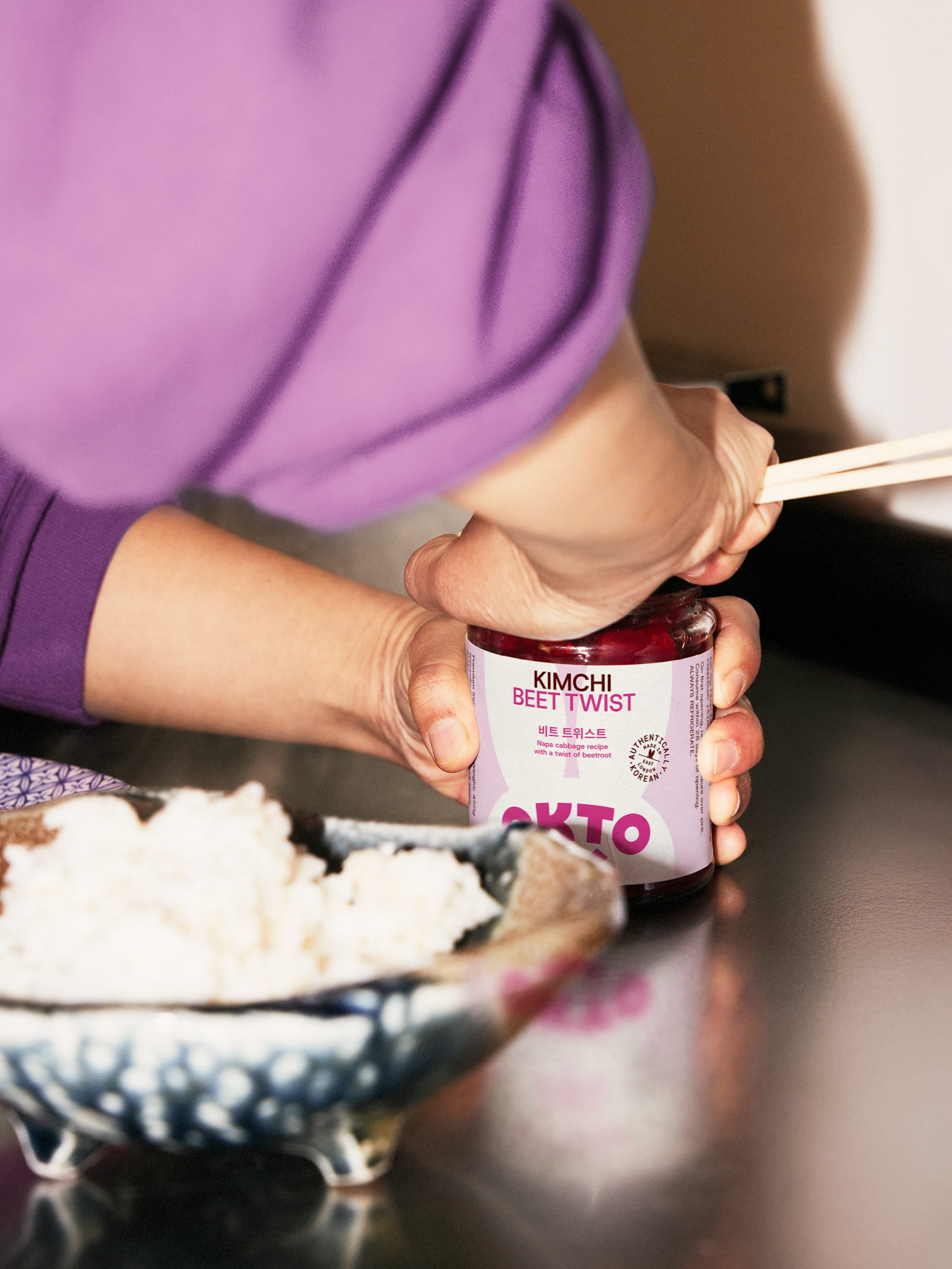
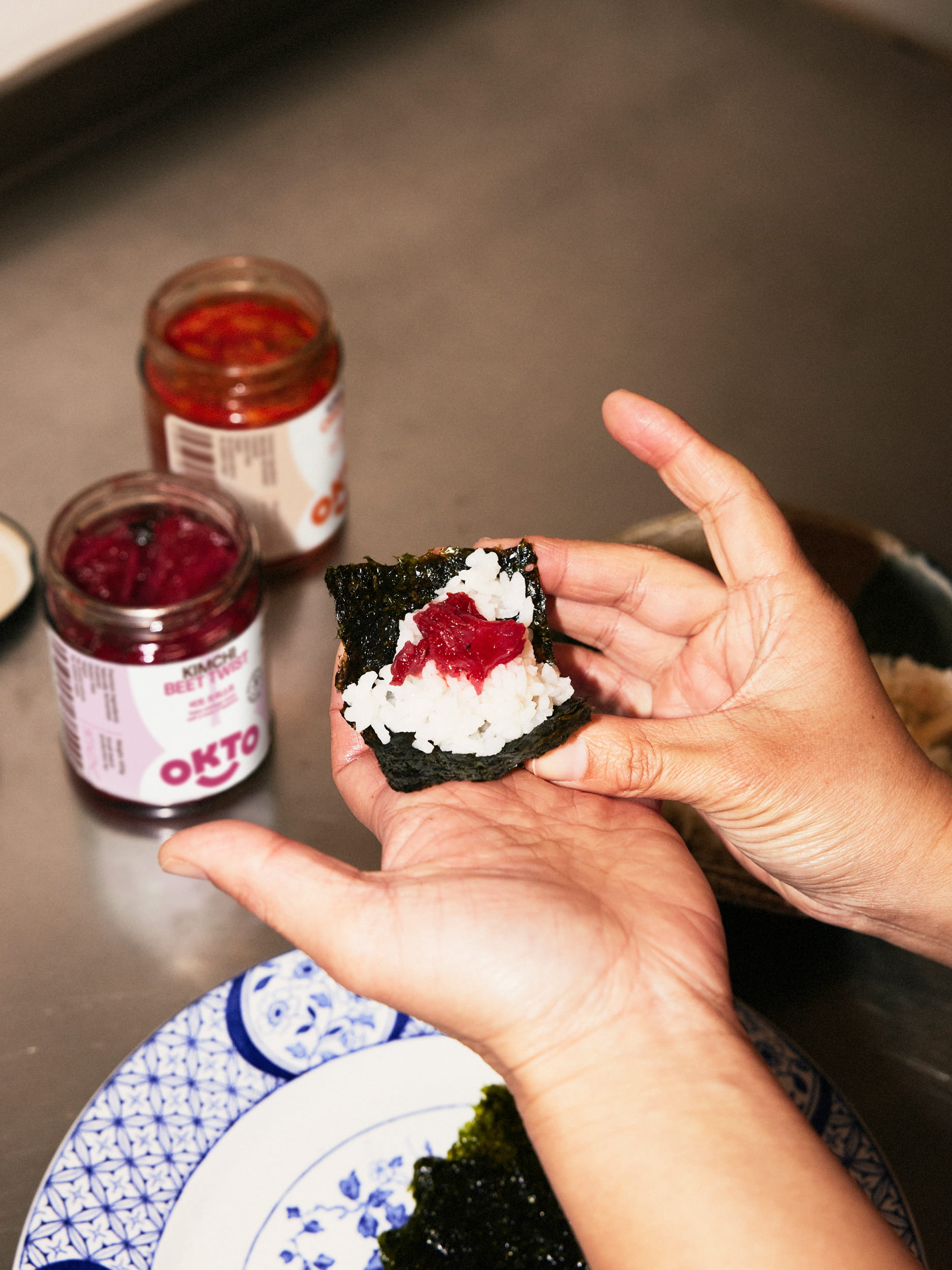
Known for fastidiously sourced ingredients - OKTO’s packaging connotes a high-quality, electing uncoated paper labelling and a creating their very own quality stamp.


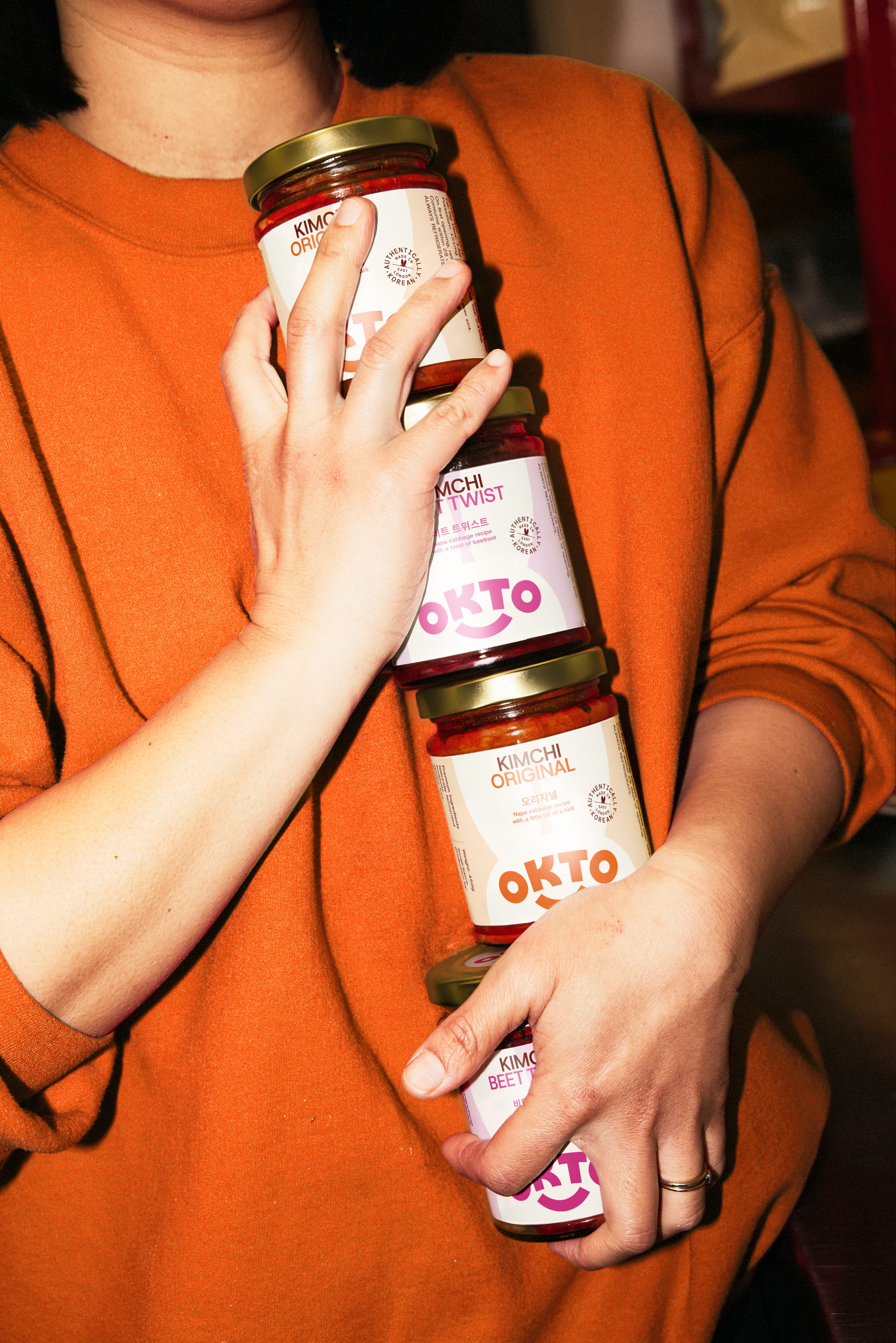
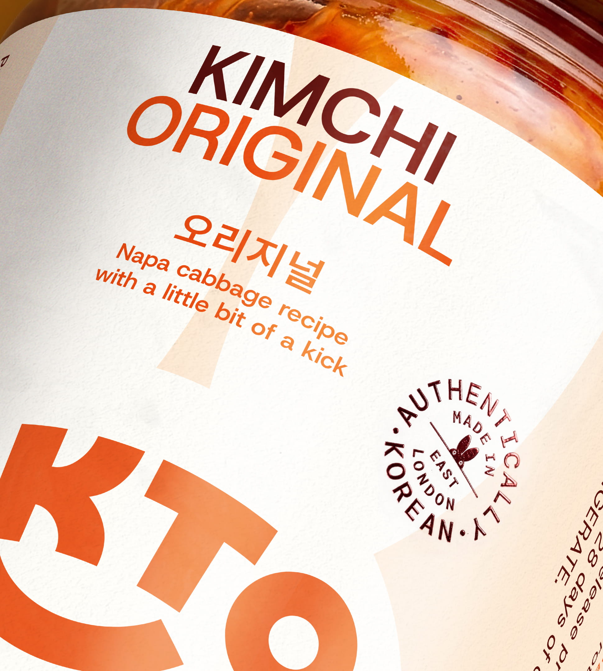
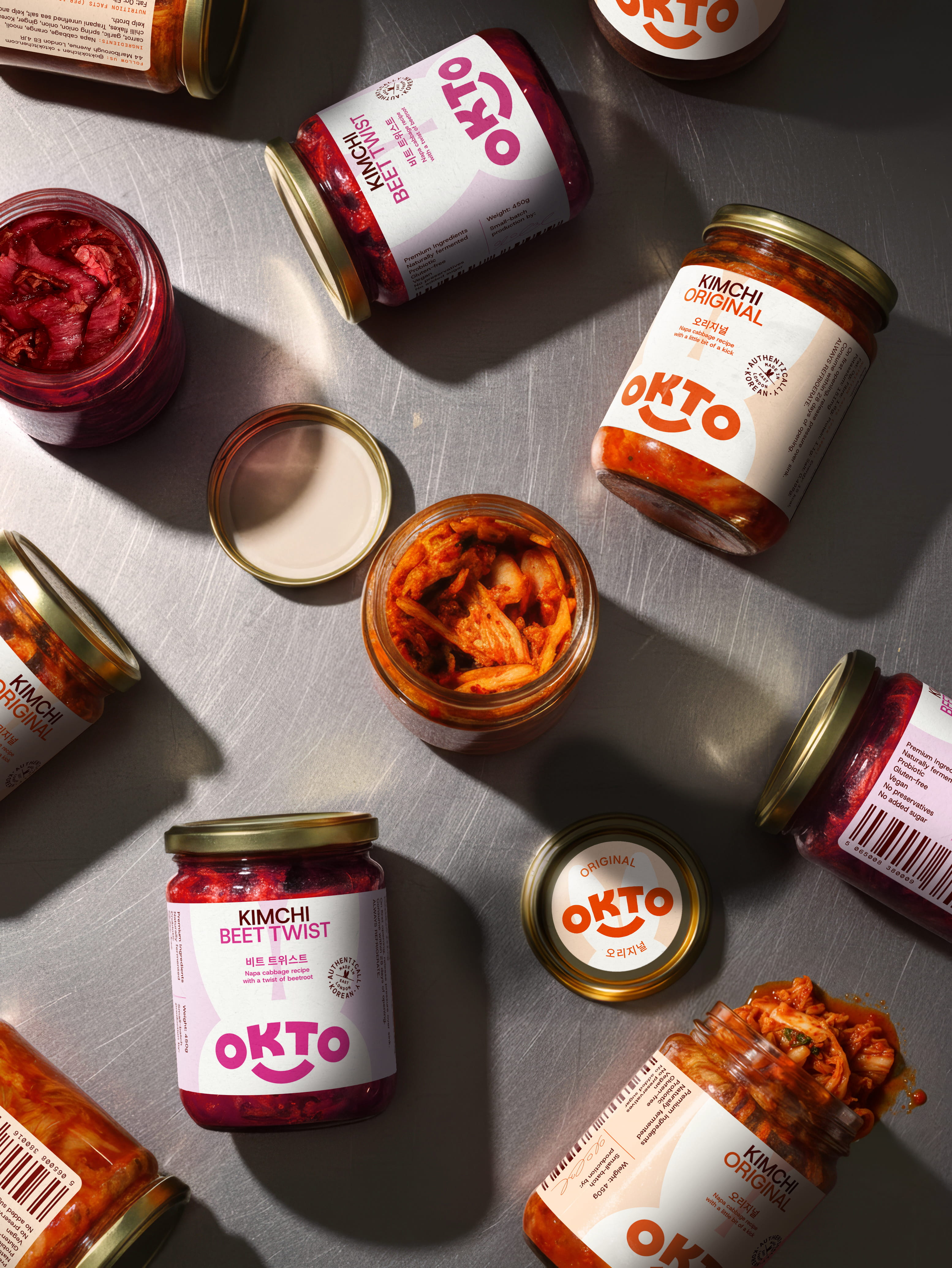
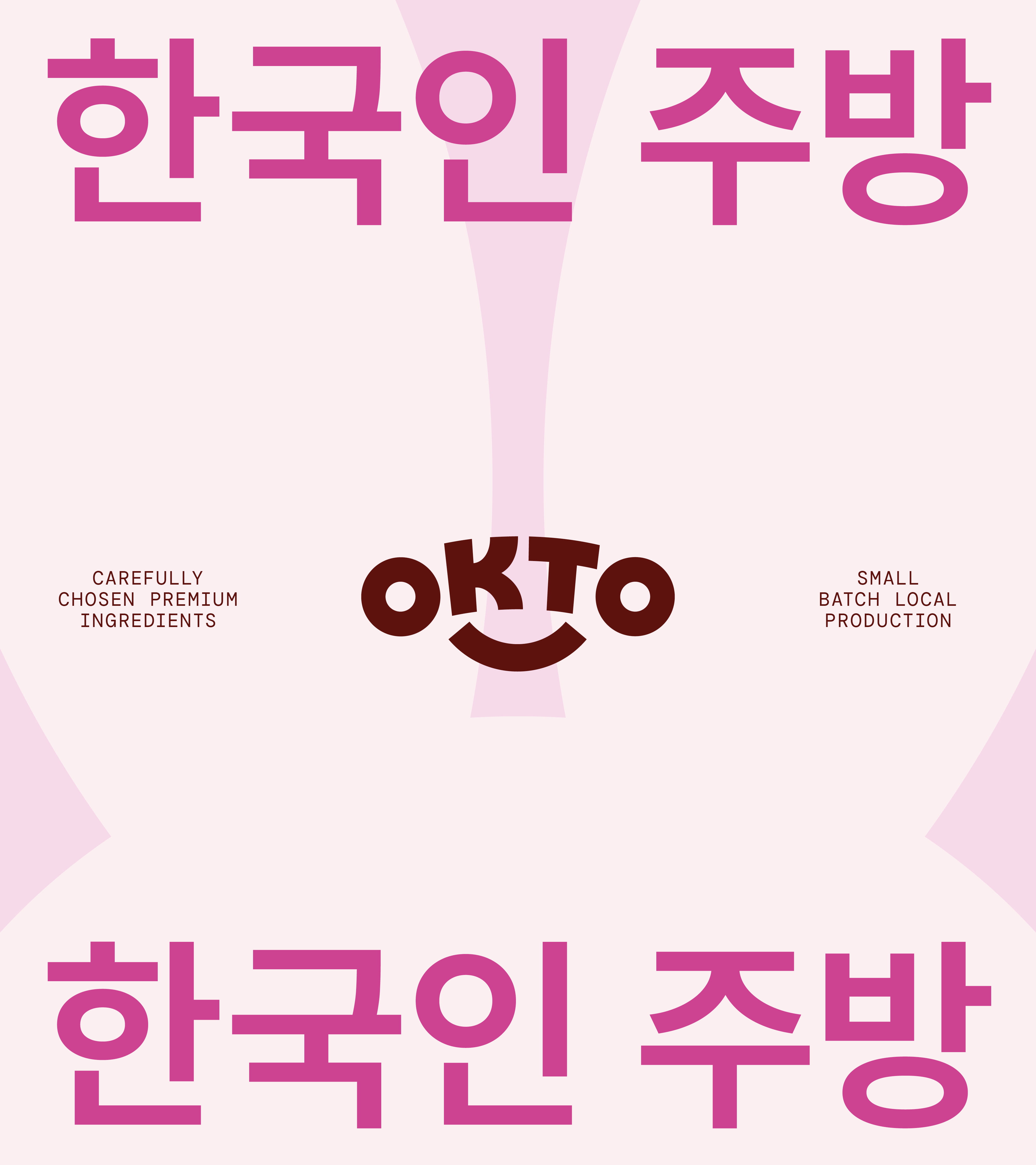
A confident contemporary sans serif, is carefully reflected with an attitudinally similar Hangul typeface - ensures parity with the brand’s dual identities.
– Thanks to Miji and Alex the wonderful founders of OKTO for a great partnership!